Tuesday, 30 September 2014
target audience research video
Monday, 29 September 2014
Font and Color Rationale
This PowToon shows my choice of color scheme and font for throughout my poster, website and even trailer.
Thursday, 25 September 2014
Preliminary Task: reconstruction
Media Preliminary Task - Reconstruction
This is a link to my reconstruction for the twlight Trailer. We had a few issues with it with losing our original footage therefore we had only a short amount of time to shoot and edit. We used our storyboards and followed the shots accordinally this was a good practice for when I create my real film trailer. We have learned from our mistakes and will improve on this.
We only reconstructed the 1st 30 seconds of the trailer because we got the idea for the shots and understood the process by this point. Although our reconstruction wasn't exact we have learned how to edit and how to use the camera.
To edit we used premiere pro

This program allowed me to upload the footage immediately. I will use this when creating my final product. I learnt some valuable skills like how to speed up time, how to slow it down, how to crop and how to add text. These are all transferable skills which I will eventually need. We also uploaded this video to youtube so this way it won't be lost, furthermore this is another skill we will have to do when creating our own final product. I am hoping due to these skills I will find it easier to create my trailer and the outcome will be much more professional due to the time I will plan for it.
This is a link to my reconstruction for the twlight Trailer. We had a few issues with it with losing our original footage therefore we had only a short amount of time to shoot and edit. We used our storyboards and followed the shots accordinally this was a good practice for when I create my real film trailer. We have learned from our mistakes and will improve on this.
We only reconstructed the 1st 30 seconds of the trailer because we got the idea for the shots and understood the process by this point. Although our reconstruction wasn't exact we have learned how to edit and how to use the camera.
To edit we used premiere pro
This program allowed me to upload the footage immediately. I will use this when creating my final product. I learnt some valuable skills like how to speed up time, how to slow it down, how to crop and how to add text. These are all transferable skills which I will eventually need. We also uploaded this video to youtube so this way it won't be lost, furthermore this is another skill we will have to do when creating our own final product. I am hoping due to these skills I will find it easier to create my trailer and the outcome will be much more professional due to the time I will plan for it.
Wednesday, 24 September 2014


Thursday, 18 September 2014
Ancillary task reconstruction: film poster


My original shot was This:

I have used photoshop in order to crop and use effects on this to make it more like the original 1996 film poster.
Previous to this I had sent my model Hannah a photograph of the film poster over the social network 'instagram' this meant she had previous knowledge and could plan in advance.

Monday, 15 September 2014
Institution Logo Ideas
Another attempt

This was one of my logo designs however I felt the one below was more simplistic and overall more professional looking. By process of elimination I have decided against this Logo.
I have created this Logo on photoshop which I think goes well with my chosen genre of horror. I will further develop this logo on After effects which will make my logo a moving image. I downloaded fonts such as Frankenstein and ghost rider from Dafont.com which i downloaded and used on photoshop. This allowed me to go past the generic fonts already given on photoshop and use my own to match it more to my genre and ideas. I added images to add to the horror genre.

Background:


I have edited my logo on after effects to make it a moving image along with my trailer. i decided to make it look like glass shattered I did this by using the shatter effect and changing the shape to glass this makes it look like the image is shattering leaving behind my film institution logo. This will create an impact on my target audience and also a wide awareness.
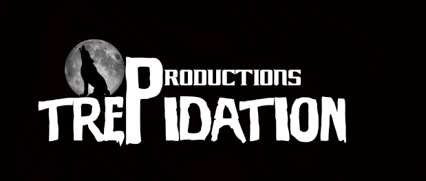
Background information about my company
Name: Trepidation Productions. I decided on this name because I wanted to link my company in with the genre of film I am creating. This concept is very important, the name means fear which compares well with my film.
Logo: For my logo I have created a trademark, this will be the wolf and the moon this will be my USP and will become instantly recognisable. I chose to create these images because I thought again they link with my genre but also because my target audience will become aware of it. The colours of black and white ensure that it fits in with the darkness element. I have made my logo glow using after effects this helps my moving picture creation and is conventional to a lot of film logos.
Background: It will be based in The UK this is because smaller british independent film companies will be more realistic for my product due to factors such as budget and lack of CGI and special effects.
Crew: I was thinking of having a small crew on this movie as typically the blockbusters have hundreds of people working on set. I was thinking around 30 people including director, cameramen/women, cast, producers, editors etc.
year: It will be established in 2013-14 this will make it fairly new therefore there can be no preconceived opinions made of the company, but it is still known to the public and has had time to establish itself
Friday, 12 September 2014
Sub genres
Action Horror
Action horror is a sub-genre that combines the intrusion of evil, an event or the supernatural in horror films with the gun fights and frantic chases that are performed in ACTION-GENRE..
Themes and elements that are often prevalent in action-horror include most commonly zombies, along with demons, gore, vicious animals and vampires.
Examples include, dawn of the dead, from dusk till dawn and blade this category also fuses the fantasy horror genre, for example resident evil,. Ghost rider and planet terror
Comedy Horror
Combines elements of comedy and horror fiction. The horror genre almost always inevitably crosses over with black comedy.
The film “The legend of the sleepy hollow” is cited to be the first and greatest comedy-horror genre..• Examples include. Scary movie , slither ,Shaun of the Dead and gremlins.


Gothic horror
Gothic horror contains bot elements of gothic and horror. Some of the earliest horror movies were of this genre..
Gothic horror films normally includes features such as castles, dungeons ruined landscapes, extreme landscapes and magic/the supernatural.
Examples include Dracula, Frankenstein and the mummy


Psychological horror
Relies on a characters fears, guilt and belief , emotional instability and at times the supernatural to build the tension and further the plot. The horror comes from the reality of this particular sub genre.
Examples include, the shining, the ring and the exorcist


Science Fiction Horror
Often deals with the paranormal but is not limited to mad scientists and /or experiments going wrong.
This genre can also deal with the fear of technology
Examples include Alien and the mist


From my previous research and planning I have decided to pick action horror as my sub-genre, this combines my two top genres from my survey therefore will attract both horror and action watchers to the cinema. My audience seems interested in the action genre so by incorporating this with my horror it will attract a wider audience but also I will enjoy making it.
Action horror is a sub-genre that combines the intrusion of evil, an event or the supernatural in horror films with the gun fights and frantic chases that are performed in ACTION-GENRE..
Themes and elements that are often prevalent in action-horror include most commonly zombies, along with demons, gore, vicious animals and vampires.
Examples include, dawn of the dead, from dusk till dawn and blade this category also fuses the fantasy horror genre, for example resident evil,. Ghost rider and planet terror


Comedy Horror
Combines elements of comedy and horror fiction. The horror genre almost always inevitably crosses over with black comedy.
The film “The legend of the sleepy hollow” is cited to be the first and greatest comedy-horror genre..• Examples include. Scary movie , slither ,Shaun of the Dead and gremlins.
Gothic horror
Gothic horror contains bot elements of gothic and horror. Some of the earliest horror movies were of this genre..
Gothic horror films normally includes features such as castles, dungeons ruined landscapes, extreme landscapes and magic/the supernatural.
Examples include Dracula, Frankenstein and the mummy
Psychological horror
Relies on a characters fears, guilt and belief , emotional instability and at times the supernatural to build the tension and further the plot. The horror comes from the reality of this particular sub genre.
Examples include, the shining, the ring and the exorcist
Science Fiction Horror
Often deals with the paranormal but is not limited to mad scientists and /or experiments going wrong.
This genre can also deal with the fear of technology
Examples include Alien and the mist
From my previous research and planning I have decided to pick action horror as my sub-genre, this combines my two top genres from my survey therefore will attract both horror and action watchers to the cinema. My audience seems interested in the action genre so by incorporating this with my horror it will attract a wider audience but also I will enjoy making it.
Thursday, 11 September 2014
Pitch
Pitch Feedback

From this feedback I have learned I need to include my institution in my pitch to let my audience know the background of my institution. I also needed to include my costume and makeup ideas which would have put across my idea better and created imagery for my viewers. However I also got some good feedback which I will keep the same in my trailer. For example one piece of feedback I got a lot was good understanding of the horror genre which means I will be able to portray this well in my trailer.
Tuesday, 9 September 2014
Shot types inspiration

This shot clearly emphasizes the vunerable state in which the woman is in. She is positioned low and crawling suggesting she is weak and stood behind her is the strong predator. This long shot allows for the audience to see the whole scene from the victims eyes and the evil side. I think this shot has major impact and thats why I would like to incorporate something like this in my own. The setting for this image is quite similar to the one in which i have decided to use and has elements which fit with the gothic genre.

This scene has an element of surprise and will be 'jumpy' for the watchers. By adding this into my film trailer it will have the same effect and add fear.
Monday, 8 September 2014
Location Recee


This is an image of a barn similar to the one on the graham way. I feel like this has the effect I want to portray in my film.
Secondary Locations

Another location will be inside of a car, the actress in my trailer will look inside the mirror and a person will appear adding a fear and shock element.
The setting of a living room will create a more homely feel and will be a juxtaposition to my other setting of the barn which is meant to put across a eerie vibe.
Friday, 5 September 2014
Costume and make-up planning
Horror Iconic costumes


Freddy Krueger with his hideously disfigured face, red & green stripy jumper, hat and spiteful looking clawed leather glove he began to invade dreams and off the children of his killers. While it took a complete reboot to make him scary again after some pretty awful sequels you can’t really say he’s not a unique and unsettling looking character and he’s definitely very recognizable The most disturbing thing is that even with all the raw looking burns across his face, Robert Englund is actually pretty recognisable underneath, which makes the prosthetic scarring seem a little more believable. This costume is iconic and remembered which is the impact I want to leave on my target audience.
What stands out is the ghost-face killer of the Scream franchise, much like Michael Myers the killers who take up this identity have chosen a readily available costume as their own personal face of evil. As in the films it really is based on an existing Halloween outfit, although significantly altered to exaggerate the features on the face for copyright reasons. The cloak that accompanies the iconic mask had to be custom made at first as the real world mask on which killers from Scream wore were a standalone item at first. Although the black-cloaked figure has become a movie icon the costume was very nearly all white.
My costume planning:
My costume planning:
In my film trailer I will also include a memorable face this will be included in the film franchise therefore will also feature on my movie poster and website. This will leave a lasting impact on the viewers therefore will be more likely to attract people. From my knowledge I know that these films have been very successful and is part of the reason I will use these costumes to inspire a new idea for my characters.
Monday, 1 September 2014
flat plans

The film title will be placed in the top 3rd of my design so it will be seen first therefore the film will be established. The title will be written in a gothic font to highlight the genre and most likely in red to establish a theme. I will include the cast and director in the bottom third of my design which is stereotypically done on most film trailers, however sometimes the starring roles are featured larger and at the top of the page to gain attention to fans of their previous films. The release date will also be included in a small font to create anticipation for its release.

This is my flat plan for my website, I have created this in order to get a layout for my final task. I have looked through a variety of different websites in order to understand the conventions and the typical design. My main image will be similar to my posters in order to establish a brand that will be instantly recognizable.
Subscribe to:
Comments (Atom)